How to Make Your Business Website Mobile-Friendly: A Step-by-Step Guide
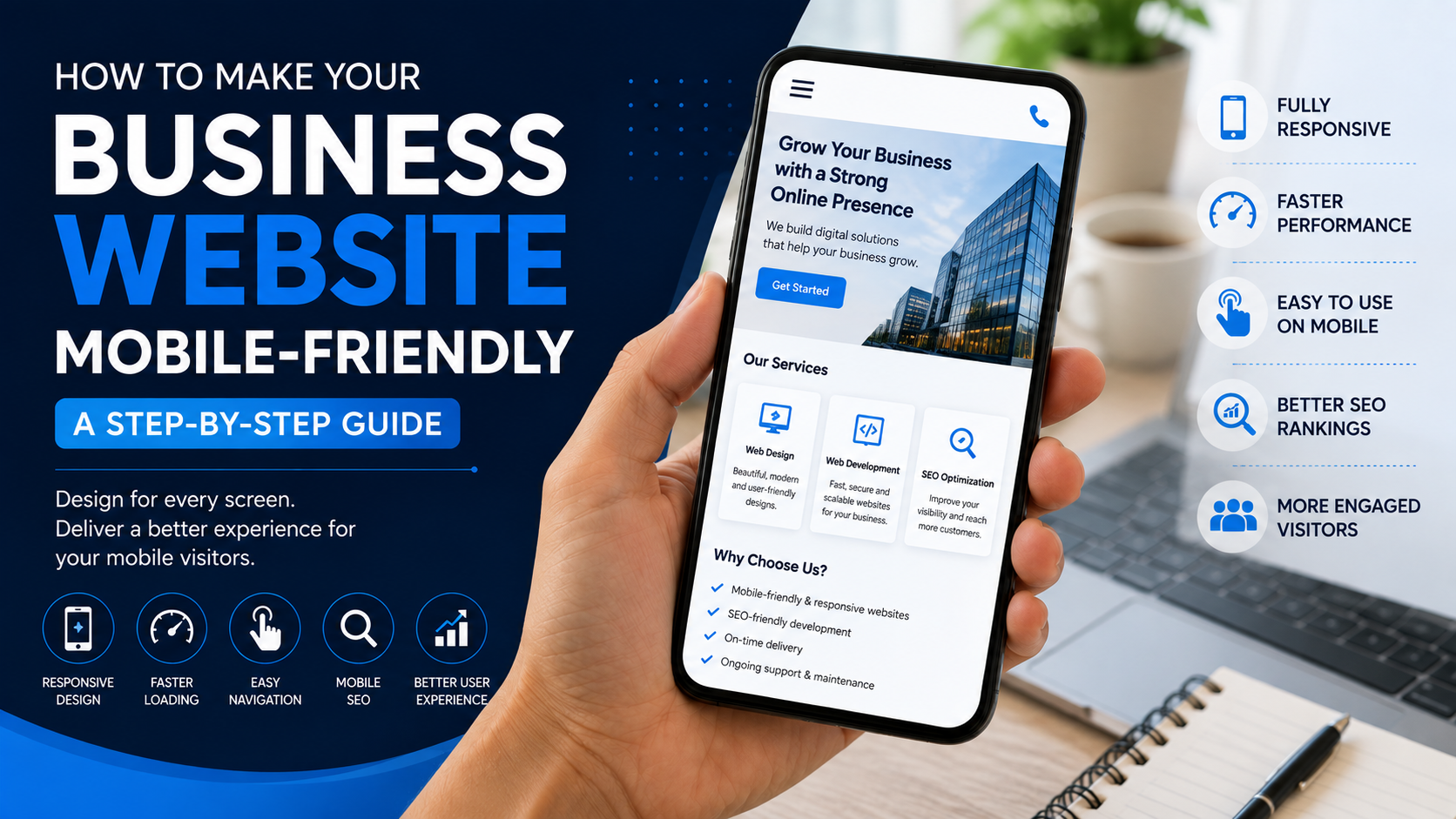
Learn how to make your business website mobile-friendly with simple steps for responsive design, faster loading, easy navigation, readable content, mobile SEO, and better user experience.
How to Make Your Business Website Mobile-Friendly: A Step-by-Step Guide
Today, people visit websites from many different devices, especially smartphones. If your business website is difficult to use on a mobile phone, visitors may leave before they understand what your business offers.
A mobile-friendly website adjusts its layout, content, images, buttons, and navigation so that visitors can use it comfortably on smaller screens.
For a business, mobile responsiveness is not just about appearance. It can affect user experience, enquiries, conversions, and how people interact with your brand online.
At C2D (Concept to Deploy), we believe a website should provide a smooth experience whether someone visits it from a desktop, tablet, or smartphone.
In this guide, we'll go step by step through the important things you can check to make your business website more mobile-friendly.
If you're still planning your website, first read How to Plan Your Business Website Before You Build It.
Why Is a Mobile-Friendly Website Important?
Imagine a potential customer finds your business through Google and opens your website on their phone.
If the text is too small, the menu is difficult to use, images don't fit the screen, or buttons are hard to tap, the visitor may simply leave.
A mobile-friendly website should make it easy for visitors to:
- Read your content
- Navigate between pages
- View your services
- Contact your business
- Submit forms
- Make bookings
- Purchase products
Good mobile design removes unnecessary difficulties and helps visitors focus on what matters.
Step 1: Check How Your Website Looks on a Mobile Phone
The first step is simple: open your website on a smartphone and actually use it.
Don't just look at the homepage. Visit different pages and test important functions.
Check:
- Does the text fit the screen?
- Can you read everything without zooming?
- Can you easily open the menu?
- Are buttons easy to tap?
- Do images fit properly?
- Are forms easy to complete?
- Does the website load quickly?
Try using your website as if you were a first-time customer.
This can help you identify problems that may not be obvious when viewing the website on a desktop.
Step 2: Use a Responsive Website Layout
A responsive website automatically adjusts its layout according to the visitor's screen size.
Instead of creating a completely separate website for every device, responsive design allows the same website to adapt to different screens.
A responsive layout should adjust:
- Columns
- Images
- Text
- Buttons
- Navigation
- Spacing
- Sections
This creates a consistent experience across desktops, tablets, and smartphones.
When choosing a website development company, ask whether responsive design is included in the project.
If you're looking for a development partner, our guide on How to Choose the Right Website Development Company can help.
Step 3: Keep Mobile Navigation Simple
Navigation is one of the most important parts of a mobile-friendly website.
Desktop websites often have enough space for larger navigation menus. Mobile screens don't.
A good mobile navigation system should be:
- Simple
- Easy to find
- Easy to open
- Easy to understand
- Easy to close
Use clear menu labels instead of confusing terms.
For example, a business website might have:
- Home
- About
- Services
- Portfolio
- Blog
- Contact
Don't make visitors search through a complicated menu just to find your contact information.
Step 4: Make Buttons Easy to Tap
Buttons that work perfectly with a mouse may be difficult to use on a touchscreen.
Make sure important buttons have enough space around them and are easy to tap without accidentally selecting another element.
Important mobile buttons may include:
- Call Now
- Get a Quote
- Book Now
- Contact Us
- Buy Now
Make your main actions clear so visitors know what to do next.
Step 5: Make Your Text Easy to Read
Mobile screens are smaller, so typography becomes especially important.
A mobile-friendly website should have:
- Readable font sizes
- Clear headings
- Comfortable line spacing
- Short paragraphs
- Good contrast
Avoid filling the screen with large blocks of text.
Break long sections into smaller paragraphs, headings, lists, and useful sections.
This makes your content easier to scan while using a smartphone.
Step 6: Optimize Your Images
Large images can slow down a website, especially for visitors using mobile networks.
Before uploading images, make sure they are appropriately sized and optimized.
Good image optimization can include:
- Using the correct dimensions
- Compressing large images
- Choosing suitable image formats
- Using descriptive alt text
- Avoiding unnecessary large images
Images should also scale correctly so visitors don't have to scroll sideways to view them.
Step 7: Improve Your Website Loading Speed
People don't always have fast internet connections when browsing from a smartphone.
A slow website can create a frustrating experience.
To improve loading performance, consider:
- Optimizing images
- Reducing unnecessary scripts
- Removing unused website elements
- Using efficient code
- Choosing suitable hosting
- Reducing unnecessary animations
Performance should be considered during development rather than only after the website is finished.
Step 8: Make Forms Mobile-Friendly
If your business uses enquiry or contact forms, make sure they are comfortable to complete on a smartphone.
Keep forms as simple as possible.
Only ask for information you actually need.
For example, a basic enquiry form might ask for:
- Name
- Phone number
- Service required
- Message
Too many fields can make visitors less likely to complete the form.
Step 9: Avoid Unnecessary Pop-Ups
Pop-ups can sometimes be useful, but they can become frustrating on smaller screens.
A large pop-up that covers the entire mobile screen can prevent visitors from reading your content or navigating your website.
If you use pop-ups, make sure they:
- Are easy to close
- Don't cover important content unnecessarily
- Work properly on mobile screens
- Don't appear too frequently
Always consider the visitor's experience before adding another pop-up.
Step 10: Make Important Information Easy to Find
Mobile visitors often want quick answers.
Make important business information easy to find, such as:
- Phone number
- Email address
- Business location
- Opening hours
- Services
- Pricing information
- Booking options
Don't force customers to navigate through several pages to find a simple piece of information.
Step 11: Check Your Website's Mobile SEO
Mobile-friendly design and SEO should work together.
Make sure your mobile website has:
- Clear page titles
- Useful headings
- Descriptive URLs
- Readable content
- Optimized images
- Internal links
- Fast loading performance
- Responsive design
SEO should be considered while building the website rather than treated as an afterthought.
You can learn more in How SEO Helps Your Business Website Rank on Google.
Step 12: Test Your Website on Different Devices
Don't test your website on only one smartphone.
Different devices can have different screen sizes and resolutions.
Test your website on as many devices and screen sizes as possible.
Pay attention to:
- Navigation
- Images
- Buttons
- Forms
- Text
- Spacing
- Page loading
- Interactive elements
Testing helps identify problems before your customers encounter them.
Step 13: Check the Complete Customer Journey
Don't stop after checking whether the homepage looks good.
Follow the complete customer journey.
For example:
Google Search → Homepage → Service Page → Enquiry Form → Contact
Check every step on a mobile device.
If a visitor wants to contact you, can they do it quickly?
If they want to book a service, is the booking process simple?
If they want to buy a product, is the checkout easy to use?
A mobile-friendly website should make the entire journey simple, not just the homepage.
Common Mobile Website Mistakes
Some common mistakes include:
- Using text that is too small
- Buttons that are difficult to tap
- Images that don't fit the screen
- Complicated navigation
- Slow-loading pages
- Too many pop-ups
- Large blocks of text
- Forms with too many fields
- Horizontal scrolling
- Broken mobile layouts
These problems can make even a visually attractive website difficult to use.
Read 7 Common Website Mistakes That Can Cost Your Business Customers for more website mistakes to avoid.
Mobile-Friendly Website Checklist
- Test the website on a smartphone
- Use responsive layouts
- Keep navigation simple
- Make buttons easy to tap
- Use readable fonts
- Optimize images
- Improve page loading speed
- Keep forms simple
- Avoid unnecessary pop-ups
- Make contact information easy to find
- Optimize important pages for SEO
- Test different screen sizes
- Check the complete customer journey
How C2D Approaches Mobile-Friendly Websites
At C2D (Concept to Deploy), we believe a website should work for real users, not just look good in a design preview.
When building a website, we consider how the design and functionality will work across different screen sizes.
Our approach focuses on:
- Responsive layouts
- Clear navigation
- Readable content
- Mobile-friendly buttons
- Optimized images
- Performance
- SEO-friendly structure
- Testing across devices
The goal is to create a website that provides a smooth experience whether your customer visits from a desktop, tablet, or smartphone.
Final Thoughts
Making your business website mobile-friendly doesn't mean simply shrinking your desktop website.
It means designing the experience around how people actually use their phones.
From responsive layouts and readable text to faster loading pages and simple navigation, every small improvement can make your website easier to use.
A good mobile experience can help visitors understand your business, contact you, explore your services, and take the next step with confidence.
Build for every screen, because your next customer could be viewing your website from a phone.
Make Your Business Website Better With C2D
At C2D, we help businesses turn ideas into practical digital solutions.
From website planning and design to development, SEO, deployment, and improvements, we focus on creating websites that are useful for both businesses and their customers.
If you're planning a new website or improving an existing one, make mobile responsiveness part of the plan from the beginning.
Have a concept? Let's turn it into something that works with C2D.
Continue Reading
Learn How to Build the Best Website for Your Business.
Then read How to Choose the Right Website Development Company for Your Business.
You can also learn about 7 Common Website Mistakes That Can Cost Your Business Customers.